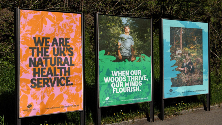
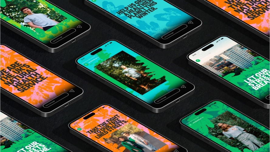
Creature London’s rebrand and campaign for the conservation charity aims to communicate the relevance of its mission to an expanded audience, putting it at the centre of its visual identity.
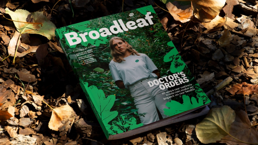
Creature London has rebranded Woodland Trust with an identity that seeks to show that the “forest-built” brand speaks to wider concerns and demographics, alongside creating its new climate-focused campaign Plant More Trees. Creature and its strategic consultancy White Crow were appointed after a competitive pitch mediated by Oystercatchers at the end of 2021.
Woodland Trust director of brand and communications Ruth Hyde explains that like other environmental charities, “we tend to get support by a group of people that look very similar. But we already know from our research that there’s something like 15 million people who are committed and ready to act for the environment, [with a diversity] similar to the breakdown of the whole population”.

The Trust’s research-led rebrand was prompted by balancing the needs of its supporters with those of “the diverse audience groups that we’re not currently engaging with”, says Ash Kirkpatrick, Woodland Trust head of marketing and communications.
Messaging needed to “translate” to both the uninformed and the expert, and to influencers, landowners and politicians, says Hyde. A focus on young people was important, she says, “because, a good number of them are really into the environment, and they’re the people affected by climate change and biodiversity”. She adds: “The cause that we’re fighting for has such broader appeal”.

A proposition was created between White Crow, Creature and Woodland Trust, combining its work “talking about the climate crisis and havens for wildlife”, Kirkpatrick says, with research findings, particularly during the pandemic, on the importance of physical and mental health. And while “we know from research that some people do not get switched on with climate”, he adds, “there are other opportunities that we can offer”.
Creature creative director Josh Dando says the approach focused on the desire to reach a wider demographic, as well as foregrounding that for those concerned about climate change, the Woodland Trust, which “strongly believes that trees can make an impact”, are a “worthy cause to get behind”.

A suite of assets was created to provide coherence, but also flexibility, “to appeal to an older generation, but to be able to add a bit of colour, vibrancy, and life”, Dando says, adding that “the climate change edge of Woodland Trust’s work definitely needed a bit more spikiness”.

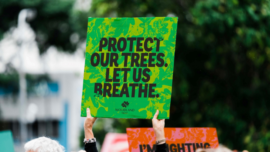
Included in the wide range of touchpoints – physical and digital campaigns, website, membership materials, a magazine and more – are protest placards. The Woodland Trust already had these, says Creature senior designer Flo Levene, but “we wanted to pare it back to feeling like a proper protest poster instead of feeling overly branded”.
The existing oak leaf logo and signature green were kept but are complemented by an expanded colour palette of three core greens, and seasonal bright and dark hues. The bright colours and contrasts, says Tim Green, Creature head of design, mean that “when people scroll on social media, they instantly capture what the Trust is trying to say”.

Andes, an existing Woodland Trust typeface, is also used, but now just in capital letters for the headline text, Dando says. Visually it “has a nod to protest posters and activism”, Levene says, “but has soft, playful accents, like the curves on the ‘c’s and ‘g’s”.
Sub-headings and quotes use serif font Woodland Bold, while Andes Book is used for body copy to help with legibility and accessibility.

A key aspect of the branding is people-centric photography: “having people the focus as much as the woodland behind them”, Levene says, which she describes as “a really unexpected approach for the Woodland Trust”. They “[look] as if they’re making a stand within the environment”, she says. “Making eye contact with the camera”, Dando adds, “you know they’re there for a purpose”.
Yet the brand is still “born from the forest” Green says, with a new leaf pattern offering a recognisable asset alongside the logo. The design team developed prints with the leaves, Green says, achieving “a nice relief just using ink”, to be used in bold colour combinations.

A campaign film, Plant More Trees, directed by Em Cole at 1stAveMachine and narrated by actor and Woodland Trust supporter Tom Hollander is being rolled out. It shows “the various things that trees can do for us in our lives – from the day-to-day romantic woodland walk, all the way up to ‘do you prefer it when your belongings aren’t floating in three foot of floodwater’”, Dando says.
While Kirkpatrick says the Trust is confident of the approach taken, he says the measure of its success will be “have we got a more representative supporter file equivalent to the national population?”